How does a data value case look like in the perfect world?
In that perfect world, it would start with a C-level sponsor who is convinced of the value data can bring. She (or he) can clearly state this value case: the question she has and how she thinks data can answer this. She realizes that this will not happen overnight, but will take effort, time, and attention. And of course, all of the data that is needed to bring her vision of value to life is fully and easily available, clean, and hardly needs any processing. So, bring out the magic wand and transfer the data into useful day-to-day value.
But how does it go down in real life? No magic but hard work – in the form of crunching data, but even more so in changing behavior. This case is about Habesha, an Ethiopian beer brewery, founded 5 years ago by thousands of proud local owners and Swinkels Family Brewers, a brewery from the Netherlands. Habesha had incredible year-on-year growth in sales, ever since selling beer by private companies was allowed. All those years the demand for beer was larger than supply. Until a year ago, when this turned around into a market where there is more supply than demand. One of the activities Habesha has been doing to gain market share and increase sales volume is to execute promotional activities. Happy hours, discounts, and placing branded fridges.
Jort Crevels (CFO) and Door Plantenga (Commercial Director): “We have a gut feeling that not all promotional activities are equally effective. Can you use our data to define which of the promotional activities are most effective, so we can execute more of those and sell more beer? Oh, and we want this not as a one-off analysis – so create us a tool that can drive intelligence in choosing the right promotions for the right customers every month, every day. Let data manage our behavior.”
Should be a doable task: “There is data available to answer this question since a new sales system was implemented 1,5 years ago that tracks every crate of beer sold per geo-location, per sales rep, and per outlet - such as a bar, a grocery or a restaurant. And there are Excel files available with actual promotions. And for sure it is possible to add some weather data and other external sources to answer the questions even better.”
- Well-defined data value case? Check
- C-level sponsors that believe in the case? Check
- Enough data available? Check
- Possible to solve this question with data science techniques? Check
- Operationalizable for day-to-day usage? Check
So let’s bring it on..
Stepping into the data journey
We always follow a 4-step approach in data projects such as this:
Step 1 is a hypothesis workshop where we pose various hypotheses linked to the main use case question. During a session with the project team, we ask everyone if they think the hypothesis is true or false. Then we let the data answer the hypothesis. This leads to a more data-driven mindset and some surprises when gut feeling differs from what the data shows. This allows to dig deeper into underlying data needs and refinement of the question.
Step 2 is to build a first model based on real, daily ingested data to answer the refined data question.
Step 3 is to start experimenting and gathering more data to prove the hypothesis and fine tune the model.
The most important step 4 is the change process - truly embed the solution into daily processes.
For step 1 we had a good starting point. One of Swinkels’ interns wrote his thesis on a sub-case. He analyzed a specific promotional activity for one area within Ethiopia: the effectiveness of placing a fridge in the Addis region. One of his findings was that not every fridge placement did lead to higher sales – but that it was difficult to calculate (let alone predict) the effect. Because, sales per outlet was impacted by many external factors, such as the weather, fasting periods, roadblocks, political situation, festivities, promotions by competitors and more.
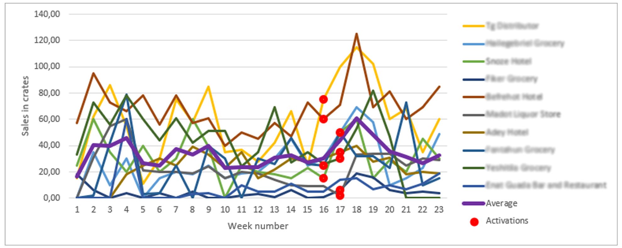
See the graph below for the sales per week for seven outlets, they show no distinct pattern nor causality. Not in weeks with activations (the red dots), nor in the weeks after activations, nor in the weeks with no activations.
We used his data set for our first analysis, and for our hypotheses workshop. This workshop, with the local sales and marketing team, helped in refining the main objective (measure the effectiveness of promotions), and defining which data is needed. It also helped in shaping our thoughts on how to define a model without the need to smooth out all unpredictable external factors. The end result was a refined use case objective: prescribe to the sales team which promotions to execute next month (based on their effectiveness in the past, and insight in the actual effect to date).
Building the data pipeline
Next step was to load the data into our data factory. It sounds easy but took some rounds of working with the SAP API to actually upload the right fields from the right tables of the data that was in the system – a total of 18 months’ of data; 82 fields, 4 million rows. Then we cleaned and ingested the Excel sheets of actual promotions. Unfortunately, there was no data from the same 18 months available for the actual promotions because the team only started capturing it for the past three months. Meaning our model would need to work on those three months (making the results less predictable).
Modeling was kept as simple as possible. No deep learning or complex machine learning – we wanted the algorithm to be explainable. Reason for this was that sales would only believe in the prescription (and act on it) if they could understand the logic behind it. So, the model clustered alike outlets (same area, same type, same number of sales) to compare them with outlets with no promotions (the control group that ‘did nothing’). This way external factors would not influence the calculation.
The model compared mean sales 4 weeks before and 4 weeks after a promotion between do-nothing and do-something. This resulted in a Sales Effectiveness KPI per promotion per cluster.
Sales Effectiveness KPI
With the Sales Effectiveness KPI we created a prescription list for the next month. It showed all possible future ‘green’ promotions for outlets in a cluster where the model predicted higher volume since a previous promotion had led to more sales. Surprisingly, we also needed to add ‘red’ promotions in the prescription list, since these specific activities in those specific outlets would actually lead to lower (minus) sales.
Data proved CFO Jort’s gut feeling to be right: not all promotions are effective. However, commercial director Door was a bit disappointed: “I expected more unexpected insights from the data, a higher ‘wow’ factor than just an Excel sheet with a KPI”. It is true that you are more likely to find what you already know in your data during the first round of exploration instead of getting mind-blowing new insights.
Let the experimenting begin
We continued to step 3 where we started experimenting. Sales received a prescription list and were asked to choose three outlets in ‘green’ clusters to perform the prescribed promotion (and for the other outlets in those clusters to do nothing). Those experiments helped in sharpening the ‘greens’ and ‘reds’.
Dashboards gave detailed feedback with drill-downs from country-level down to area- and sales manager-level. Really showing which ‘green’ promotions were actually boosting sales, and which ‘red’ ones actually lead to lower sales. Jort and Door: “This really helps us in digging into what works and what doesn’t, and why. It is a learning tool and mirror for us – it helps to start a conversation about required actions.”
Creating value out of data doesn't happen overnight with magic
One month of experimenting, however, proved way too short for such a large country with thousands of promotions per month. At that point the C-level support was really necessary: no results overnight meant no belief in the prescription. With the effect that day-to-day operations were taking precedence over the more structured way of working with prescribed promotions.
A strong push from both Jort and Door helped to actually keep on working with the prescriptions. They planned a six-month embedding period, tracking the actual promotions and the (positive) effect of executing the activities from the prescription list, and talking about the detailed insights.
Long story short: creating value out of data does not happen with the magic wand, even with strong C-level belief in the value of data. But data proved a gut feeling to be right, enabling to embark on a journey toward higher sales volumes based on data-driven actions.